Brick & Bell Mobile App
Designing a mobile app for the wonderful cafe Brick & Bell: Bridging community and technology. Enhancing accessibility and promoting warmth and elegance, the app offers seamless ordering and comprehensive cafe information for a magical experience.

Overview
The objective of my solo passion project was to create a mobile app for the coffee shop Brick & Bell to promote their sense of community, warmth, and elegance. As a regular at Brick & Bell for over three years, I have come to regard this place as home, and I wanted to bridge the gap between accessibility to technological marketing strategies and immigrant-owned small businesses. The app would allow customers to easily and conveniently order their products, as well as find all the information about the cafe in one place so that more people can share in the magic of Brick & Bell.
Info
Project Type
Project Duration
Client
Role
App Design
June 2023 - September 2023
Brick & Bell (proposed)
UI/UX Designer and UX Researcher

B&B Project Timeline

Problem
Nearly half of individuals aged 18 to 24 drink coffee regularly, and over 70% of seniors do as well. This demographic aligns closely with Brick & Bell's primary clientele, which consists predominantly of elderly patrons and college students. The pandemic accelerated the adoption of online ordering technology in independent cafes, as customers became more comfortable with quick, grab-and-go service.
Despite these trends, Brick & Bell is not well advertised. The cafe's main strengths lie in its beautiful environment, friendly staff, and affordable prices, which are not adequately showcased through its current marketing strategy. Many small coffee shops, including Brick & Bell, rely solely on social media for promotion and sales. This approach may limit their growth, as it excludes potential customers who do not use social media or do not think to search for coffee shops on these platforms. Without a dedicated app or website, it becomes more difficult for customers to order, leading to decreased sales, frustration, or a shift to competitors.
Additionally, independent coffee shops face significant challenges in investing in technology. The costs of developing an app or a comprehensive website can be prohibitive, both in terms of time and profit, and many small businesses cannot afford this expenditure. For instance, setting up a mid-size coffee shop can cost between $80,000 to $300,000, with significant expenses allocated to essential equipment such as commercial espresso machines and coffee roasters (Craft Coffee Spot).
Independent coffee shops often succeed by providing unique, personalized experiences that larger chains struggle to replicate. Customers are 1.2 times more likely to spend an hour in an independent shop compared to a chain, reflecting the warm and inviting atmosphere that local cafes offer (Best Quality Coffee).
In summary, creating an app for Brick & Bell could bridge the gap between traditional small business practices and modern technological marketing strategies. By enhancing accessibility and streamlining operations, the app could help Brick & Bell reach a broader audience, increase customer satisfaction, and ultimately thrive in an increasingly digital world.
Solution
To effectively support Brick & Bell Coffee Shop, I propose creating a simple, aesthetically pleasing app that encapsulates its elegant, community-oriented environment. This app will streamline operations, expand customer reach, and enhance competitiveness with larger companies.
The app will include an "About Us" section, conveying the café's rich history, mission, and introduction to its friendly staff, highlighting the personal touch that sets Brick & Bell apart from larger chains. This personal branding will strengthen the cafe's connection with its loyal customers while attracting new ones by showcasing its unique charm.
Additionally, the app will feature user-friendly ordering services, allowing customers to easily browse the menu, place orders, and make payments. This convenience will cater to the tech-savvy demographic of college students and the elderly, who are significant patrons of Brick & Bell. As the pandemic has accelerated the adoption of online ordering technology, having a dedicated app will meet the rising demand for contactless transactions, enhancing customer satisfaction and operational efficiency.
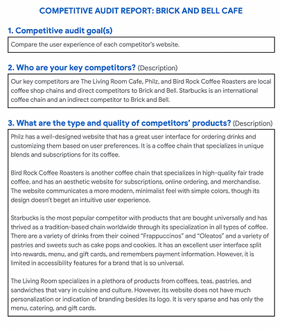
Moreover, Brick & Bell's competitive pricing will be prominently displayed. A regular small coffee at Brick & Bell is priced at $1.95, compared to Philz Coffee at $4.30 and Bird Rock Coffee at $3.65. Highlighting this affordability will attract budget-conscious consumers who seek quality without high prices.
The app will also address the limitations of relying solely on social media for marketing and sales. While social media platforms are useful for engagement, they cannot fully showcase the café's offerings or provide an integrated ordering experience. By developing an app, Brick & Bell can enhance its digital presence, making it easier for customers to find and interact with the café, thereby driving more traffic and increasing sales.
In summary, the creation of a dedicated app for Brick & Bell Coffee Shop will provide a comprehensive digital solution that enhances customer experience, improves operational efficiency, and strengthens the café's market presence. By integrating all essential information and services into one platform, Brick & Bell can foster stronger community connections, attract a broader audience, and achieve sustained growth in the competitive coffee shop industry.
User Research
I began this project by doing preliminary research on similar small coffee shops and cafes through competitive analysis and exploring bakery and coffee products. I also conducted primary research through interviews with who we believe are stakeholders of our product, those who frequent coffee shops for work or leisure, as well as usability studies to identify potential solutions for improving the user experience.
Pain Points

Competitive Analysis
I conducted a competitive audit by comparing the online ordering experiences of direct and indirect competitors with the aim of identifying the needs of customers at coffee shops.


Personas


User Journey Map
To understand the problems and experiences a user would have to achieve their goal, I created a user journey map for Flora to empathize with her and theorize her behavior and mood when ordering at Brick & Bell to help improve her user experience.

Storyboarding

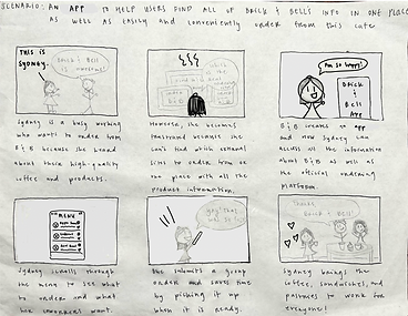
User Flow

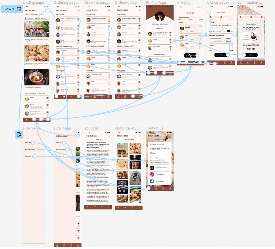
Low-Fidelity Design & Prototyping
Paper Wireframes
I created multiple wireframes that showcased possible blueprints to solutions that could solve our stakeholder's needs. We settled with the wireframe below as it allows for the best balance between simplicity and function:
The features within this design include:
-
Home page
-
Ordering page
-
Checkout page
-
User profile page

Lo-Fi Design & Prototype
From there, we put together rough mockups that translate our wireframes into design sketches that showcase where the components of our features will generally be positioned. By visually displaying the user flow of our feature, we were able to conduct user testing before further iteration to get a better sense of the functionality of our interface.
On top of designing screens that shows us where the placement of features will be, we also linked up the design to give us a more comprehensive look regarding how the interaction will look like. This allows us to conduct user testing on the interaction of the interface.


High-Fidelity Testing & Prototyping
Usability Testing: Findings
I conducted two rounds of usability studies. Findings from the first study helped gather key insights to transition from low to high-fidelity iteration. The second study was based on my high-fidelity prototype which helped me discover which aspects of my design needed refining.

The first usability study revealed frustrations with the navigation bar as features were represented by icons rather than words. To make the design more intuitive, I added labels to the icons in the navbar.


The first usability study also revealed that users were confused about their stage in the checkout process, which I remedied by creating a status bar to track checkout completion. I also removed the notes section to promote simplicity.
Earlier designs allowed for some customizations, but after my second usability study, I added additional options for tips, and made it simple by creating buttons for the common tip amounts. I also revised the design so that the payment information is more visible to the user.

Key Mockups

Style Guide

Hi-Fi Prototype
With our high fidelity prototype, we transitioned our lo-fi iteration based on the feedback we got from our usability studies and implemented all the changes for the style, the checkout process, and the side menu.
Accessibility Considerations

Takeaways

Next Steps
